Lavarta Travel App
- Robert Anascavage

- Dec 2, 2018
- 3 min read
Updated: Apr 23, 2019
Goal: Design a travel application for Lavarta.
Duration: 3 months (class project) Role: Team Lead

The only explicit requirements that were necessary were that it needed to be a mobile application and be targeted towards international travel. I decided to start with some generative research to see if there were some specific problems we could solve. With that in mind, I generated an interview template to see what people liked and disliked about international travel.

Generative Research
Who we reached out to
We interviewed 10 people with the requirement that they must have traveled internationally within the past 3 years
● Age: 25~30 - 5 people, 30~35 - 5 people
● Gender: 4 females, 6 males
● Place of birth: 4 East Asia, 2 South Asia, 3 North America and 1 Africa
● Travel Frequency: 3 high-frequent travelers (>5), 6 mid-frequent travelers (3~5), 1 low-frequent traveler(<3)
● Method: In person and over the phone

Aside from the demographic data, we had a number of qualitative experiences that we needed to categorize and began coding and sorting.


After transposing the various shopping experiences onto notes, we quickly found 5 main themes:
● Trip Planning / Research
● Apps / Internet
● Traveling / Looking Around
● In the Store
● Checkout

I then applied this information to generate a Persona (and later our app's features) and decided to create an app that would be functional offline while still addressing currency concerns.

With Christopher in mind, we began to storyboard

Which in turn led to sketching and insight on how to address the user's earlier pain points (and "must have" features) and how the application should flow.

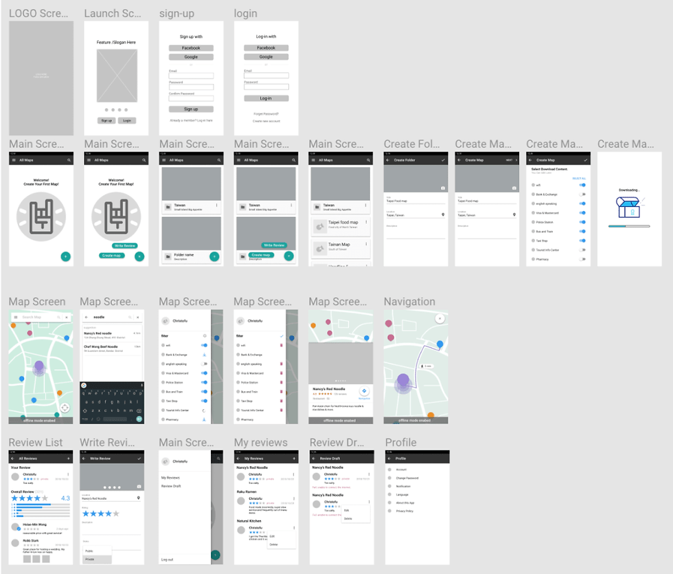
Once we had a solid process map laid out, we began prototyping and created a wireframe to see if navigation was as fluid as we planned.

Since two-thirds of my team were on Windows, we elected to use Figma, an online collaborative design tool, to create our LoFi and HiFi designs.
Evaluative Research
A few iterations later, we were ready to begin the evaluative research phase. We came up with five tasks we believed would be representative of our user base from the earlier generative research.
● Task 1: Sign-up (to make sure it's easy and simple or else users may give up)
● Task 2: Create a downloadable map (for offline functionality)
● Task 3: Search a noodle restaurant and use navigation (the travel purpose of the app)
● Task 4: View reviews (informing the user)
● Task 5: Write review (informing future users)
Pressed for time, we ran 3 users through the tasks and found that while 3 of the tasks appeared fine, Tasks 3 and 4 were not as intuitive as I liked.

To address this concern, we updated the design to include more hints in the form of icons and names.

Summary of Findings from Evaluations and Recommendations for the Developer.
Problem 1:
The user doesn’t know where they stand in the map creation process. The process of creating a map is a little confusing, since the user does not know the amount of steps that remain in creating a map. They go through each process, one step at a time, without knowing where they are in that process.

Heuristic Type: Visibility of system status
Severity: Minor
Recommendation: Provide the steps of creating a map on the top of the screen and highlighting the steps that have been completed by the user.
Problem 2:
“Create a map” is vague terminology. The user could be confused by “create a map” since what the “create a map” function really does is creates a location.

Heuristic Type: Match between system and real world
Severity: Minor
Recommendation: Change the “create a map” text to “add location” or “create location”.
Problem 3:
The user cannot find a way to directly go back from a selected restaurant.

Heuristic Type: User control and freedom
Severity: Fix later
Recommendation: Add a back-arrow on top of the screen for the user to navigate back to the previous screen or highlight the map for the user to indicate that the user can click on the map to get back to it.
Problem 4:
The back button is not present on the Map screen. Instead, the user presses the X button instead of a back button to navigate back to the previous screen.

Heuristic Type: Consistency and standards
Severity: Fix now
Recommendation: Add a back button to the map screen and remove the X button next to the search bar.


Comments